
Before you launch: test with a few people, then make it simpler
Small usability tests and simpler forms are two of the cheapest ways to improve a new website, app or digital product before launch. Here is how to do both.

Our work
Dignity Access Limited makes WashPod accessible wetrooms that help people stay at home or come home from hospital. We gave the company its own brand for the first time, then carried it through everyday materials, literature and a new website.
Dignity Access Limited had never had an identity of its own. The website header and favicon used the WashPod logo, with the company named only in a faint line beneath it. That became a real problem when Dignity Access set out to become an Official Reseller of Cura+: there was no company brand to stand alongside Cura+. The brochures used five typefaces, disagreed with each other on details such as phone numbers, sizes and lead times, and could not be printed to a professional standard.
Tell us where you are and what you need. A free discovery call is the easiest way to find out whether we can help.
Use the previous and next buttons, swipe, or the left and right arrow keys on a link to move through the posts.
Small usability tests and simpler forms are two of the cheapest ways to improve a new website, app or digital product before launch. Here is how to do both.
What Skills for Care's figures say about care worker turnover, why the first year matters most, and practical ways providers can help good carers stay.

What the latest NHS England figures show about delayed discharge, why delays build up at handovers, and practical ways to help people get home.
Where AI genuinely helps a business grow, where it does not, and how to start safely, especially if you work in health and care.
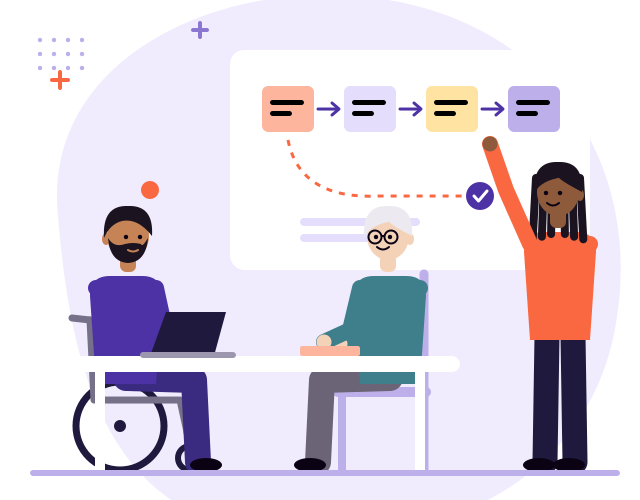
Selling to the NHS and councils is different. Who decides, the rules that shape buying, the assurance buyers expect, and how to plan your route in.
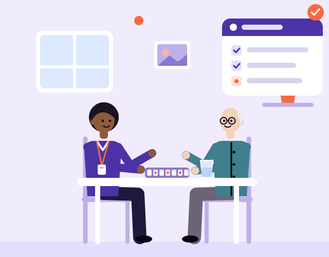
Most registered care services in England now use a digital social care record. Here is what the next step looks like, and how to get more from the system you already have.
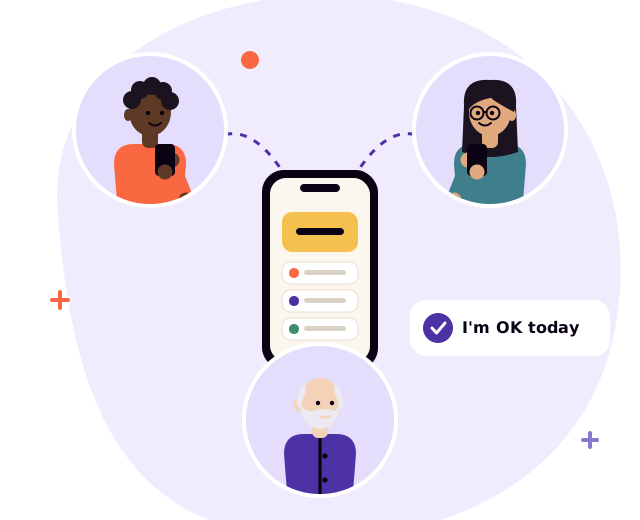
One in four people in the UK are disabled. Why accessible websites and apps matter, what WCAG 2.2 AA means, and how to build it in from day one.
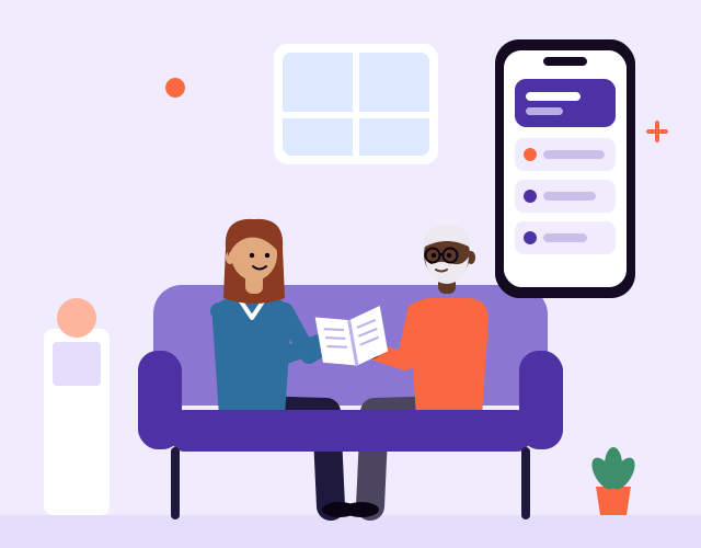
Around five million people in England and Wales provide unpaid care. Practical ways to design services, apps and information that fit around their lives.
Fewer features, fewer messages, fewer steps. Why doing less, on purpose, often makes products, brands and services better for the people who use them.
Before you choose software, decide where the truth lives. How to pick a tech stack that grows with you, built around a single source of truth.